kapaas
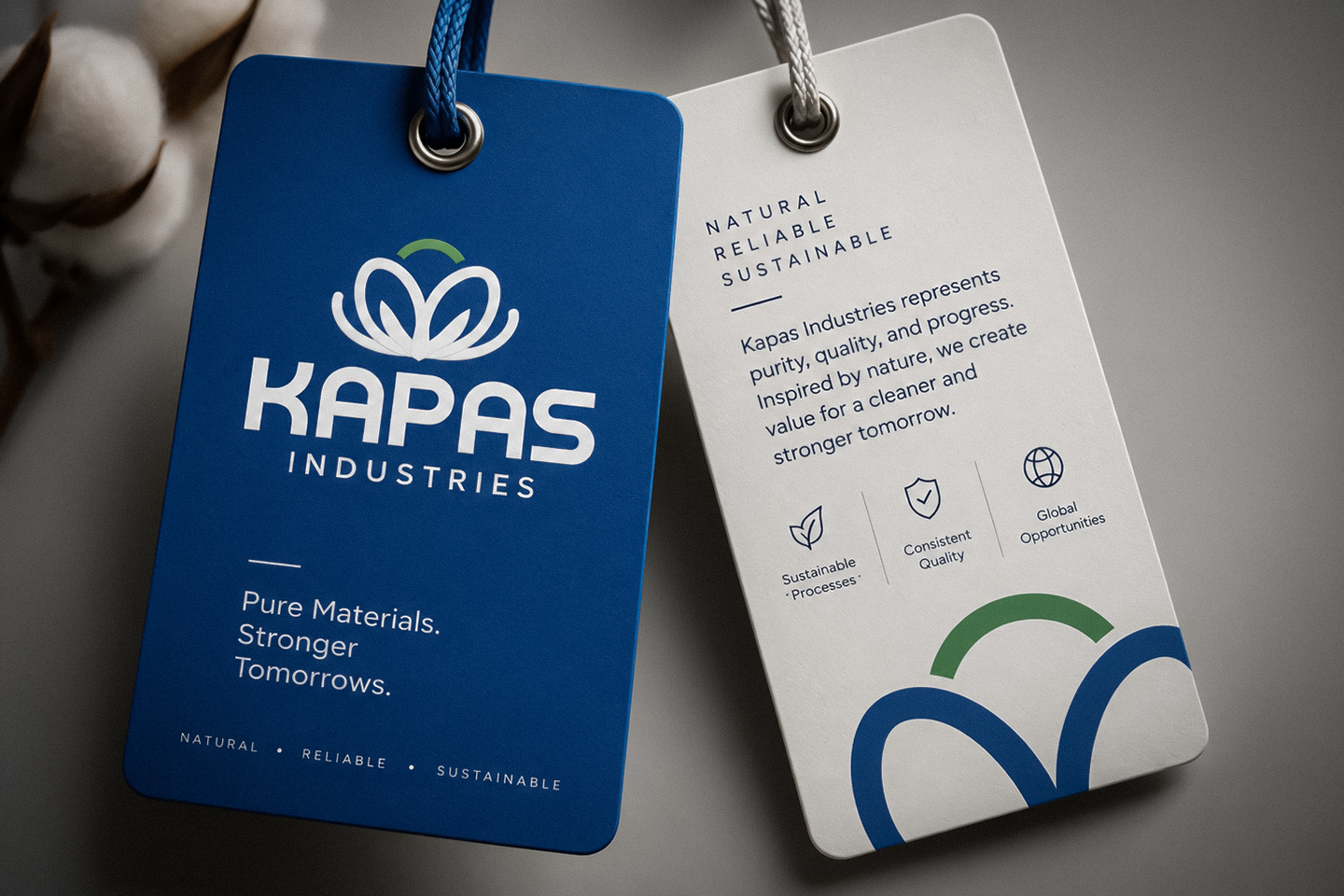
Kapaas — logo identity crafted by The Logoboy

Kapaas ka logo design — The Logoboy portfolio se.
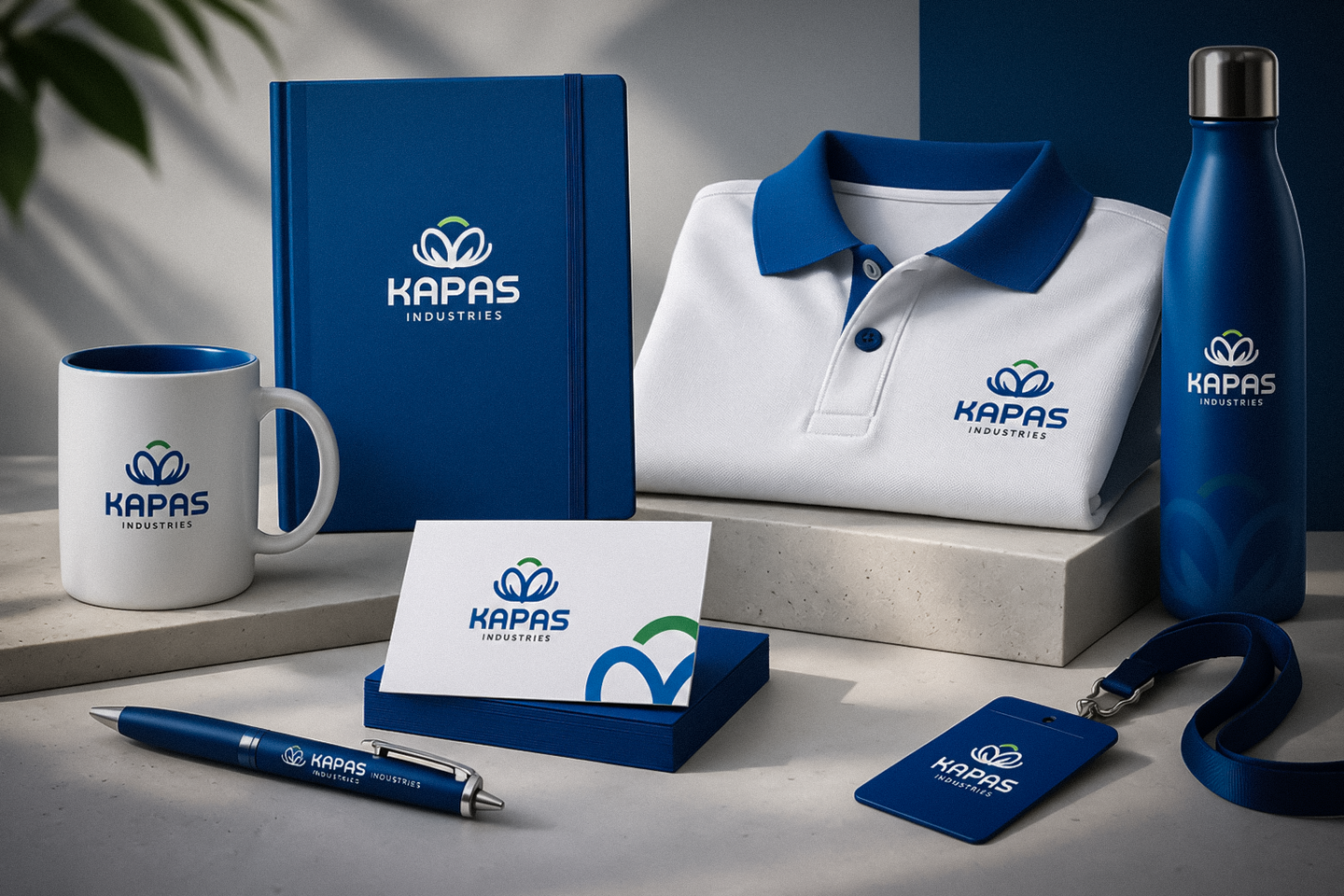
Every detail of this system was crafted to align brand perception with business growth, ensuring consistent resonance across physical, digital, and spatial environments.
Color Palette & Architecture
A disciplined color system calibrated for maximum contrast, legibility, and modern brand recognition.
Crafted for Longevity
Every asset was stress-tested across print collateral, high-visibility signage, and responsive mobile interfaces to ensure seamless brand consistency.
Making Complexity Feel Human
Creating high brand recall in an increasingly competitive market segment.
Balancing technical authority with approachable, customer-centric storytelling.
Designing an agile identity system capable of scaling across digital products, packaging, and high-impact signage.
Engineered for Performance
Strategic Brand Foundation
We engineered a modular visual language tailored to communicate reliability and speed across every brand touchpoint.
Scalable Design Architecture
From vector emblems to packaging guidelines and responsive digital experiences, every element was built to perform under real-world constraints.